Home
A filter request that became a new category architecture
How a two-week feature request became a redesign of the Gemstones category page Information Architecture.


Nivoda is a B2B marketplace connecting jewellers with diamond and gemstone suppliers globally
The ask.
The Gemstones team came to me with a feature request: add subtype filtering to the Gemstones page. Gemstone families (like Sapphires and Rubies) each contain subtypes (like Padparadscha and Star), and the team wanted buyers to be able to filter down to them. This would grow the available type filters from roughly 30 to over 70.
It looked like a two-week filter job. It became a full rearchitecture of the category.
250+
gemstone type/color/shape combinations
13
combinations accounting for 57% of total sales


Top 5 gemstone types by unique filter uses, over 26 days
At the time, Nivoda featured over 250 gemstone type/color/shape combinations, with just 13 of them accounting for 57% of total sales. Internal data also showed that gemstone type was by far the most used filter on the platform, well ahead of colour, clarity or any other attribute.
Gemstones, however, had never had a category architecture of its own. The platform was originally built around Diamonds, and when Gemstones was added later, it inherited the Diamonds information architecture: a single product listing page (PLP) with every gemstone family and subtype competing inside one shared filter panel.
Identifying the problem.
Before touching the filter panel, I audited the category as it stood. Diamonds have a universal, standardised grading system; gemstones don't. Our own training documentation made the case plainly:
“No two gemstones are alike in colour, clarity or other defining qualities.”
This makes a single uniform grading and filtering system a poor fit and is a structural difference that showed up in how buyers actually think. Research confirmed it: buyers instinctively start by browsing a type, then a subtype. Not by colour or any other cross-cutting attribute. Continuing to patch the Diamonds-shaped filter panel with more subtypes wasn't going to fix that. It was reinforcing the mismatch.
The real problem wasn't missing filters. It was that Gemstones had never had an information architecture of its own.
What didn't work.
Before landing on a rearchitecture, I tried to solve this within the existing single PLP structure:
-
Solution A
Didn't work
Nesting subtypes under gemstone families in the filter panel meant too many levels deep to use quickly.
-
Solution B
Didn't work
Exposing all filters at once overwhelmed the panel with around 30 subtypes spread across 10 families.
-
Solution C
Didn't work
Quick filters directly on the PLP competed with the filter panel making buyers unsure which controlled what.
Every version was still, fundamentally, one big PLP trying to hold every gemstone type's logic at once.
The reframe.
“How might we let buyers navigate gemstones the way they actually think about them?
By type first and without cramming every family's filters into one shared space?”
Introducing segmented disclosure.
I rearchitected Gemstones around segmented disclosure. Reaching a specific subtype requires going through its parent type first rather than filtering across everything at once. Because this was going to reshape the whole category, I presented the solution to both my PM and our gemstone specialist, who had been brought in to provide the data for the new filters. She sat outside the sprint team but the new architecture matched what she was hired to deliver. With a small push on the roadmap, the feature request became the foundation for the category expansion.
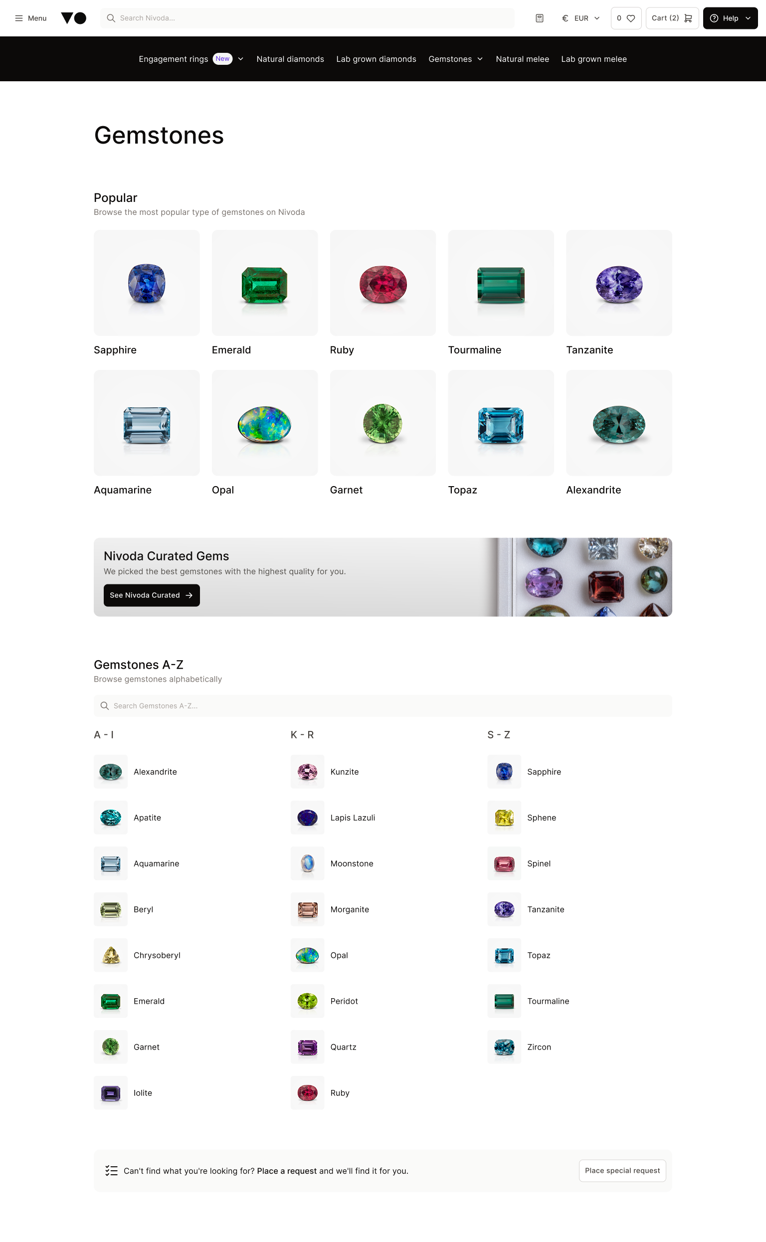
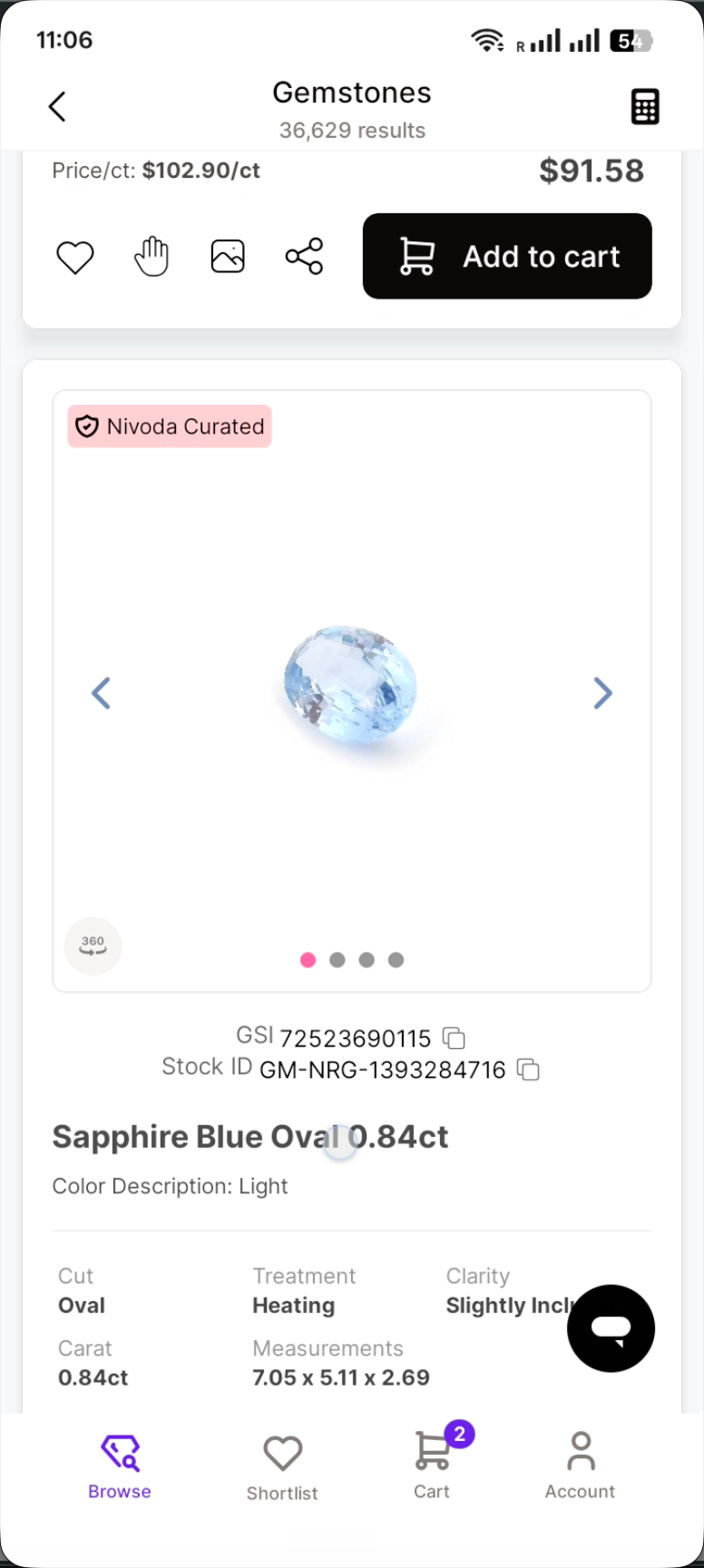
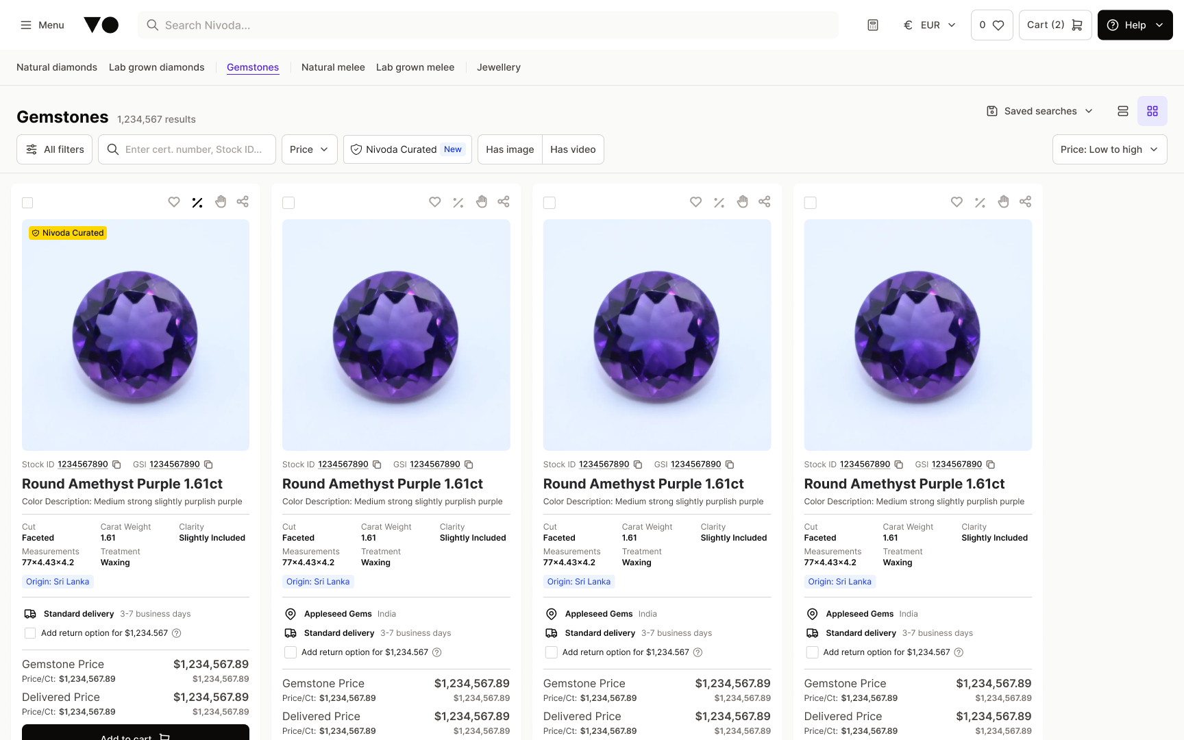
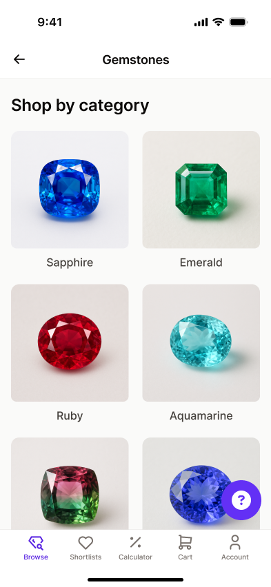
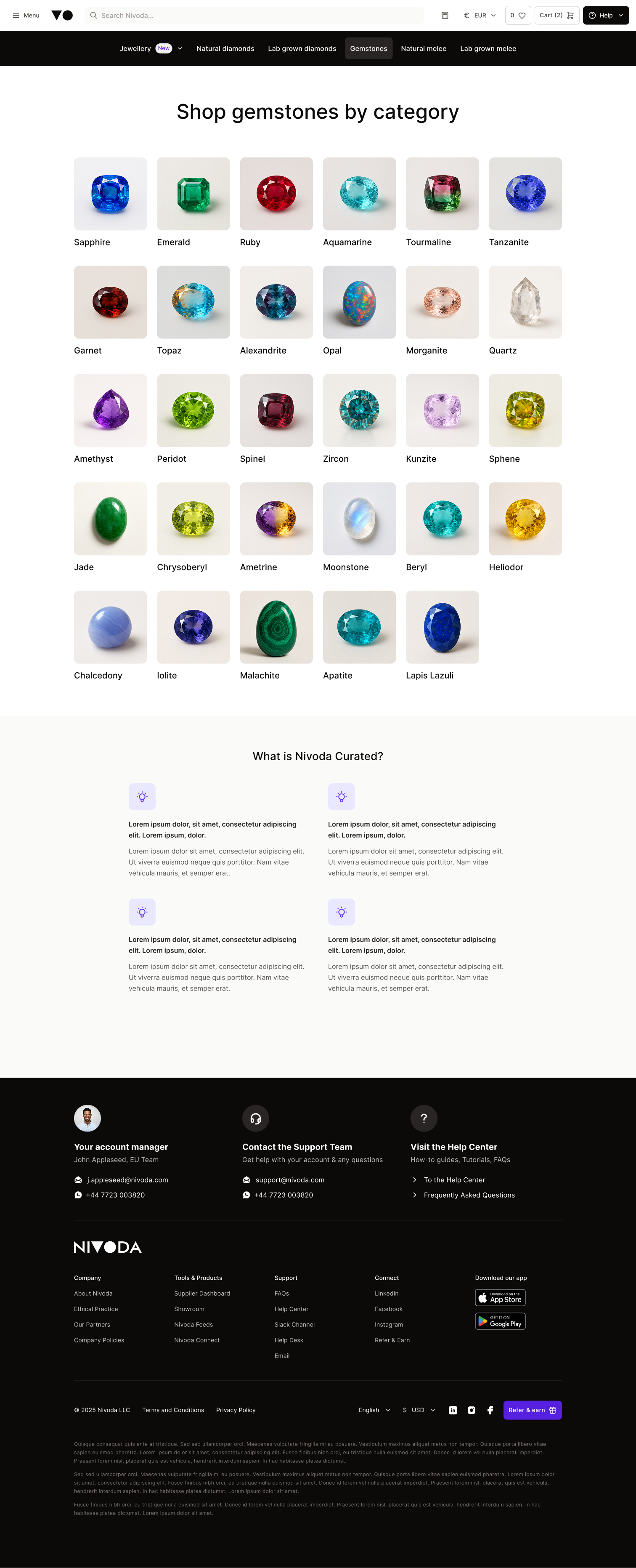
Before: the legacy Gemstones listing page, one grid sharing a single filter bar. After: the redesigned Gemstones landing page, a grid of gemstone categories.

Before
The Gemstones PLP serving as the category homepage; one flat page built on Diamond patterns with every family and subtype sharing a single filter panel.
After
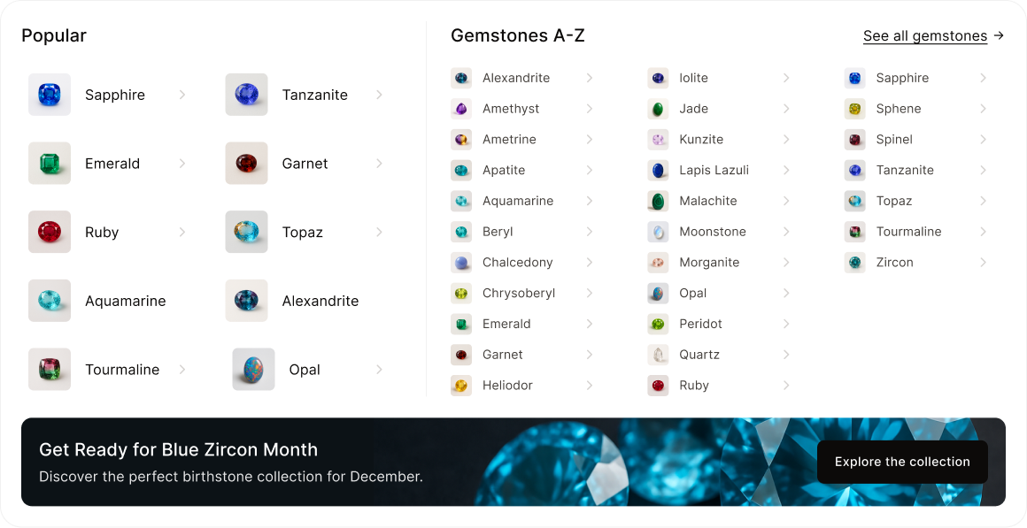
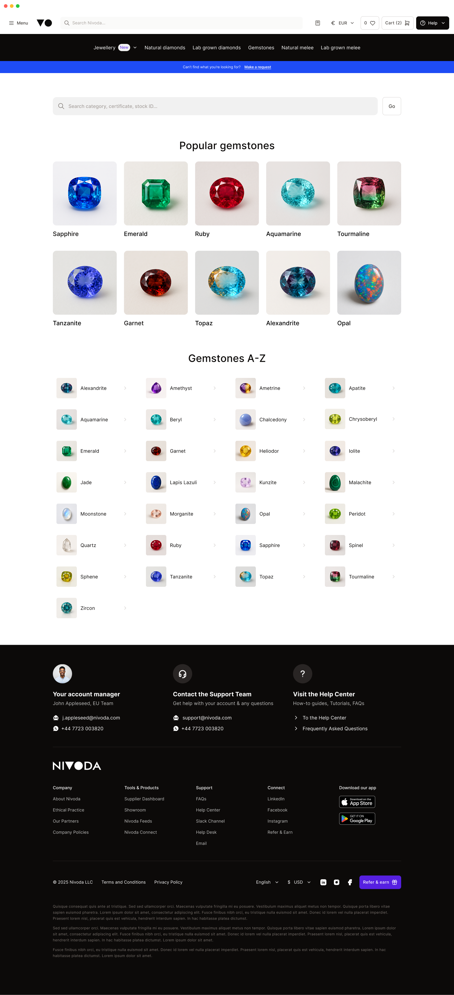
A new top-level Gemstones landing page that serves as a category hub rather than a PLP. Organised by popular types and a full A–Z index. From there, buyers pick a family and land on a type-specific PLP.
Compensating for the segmentation cost.
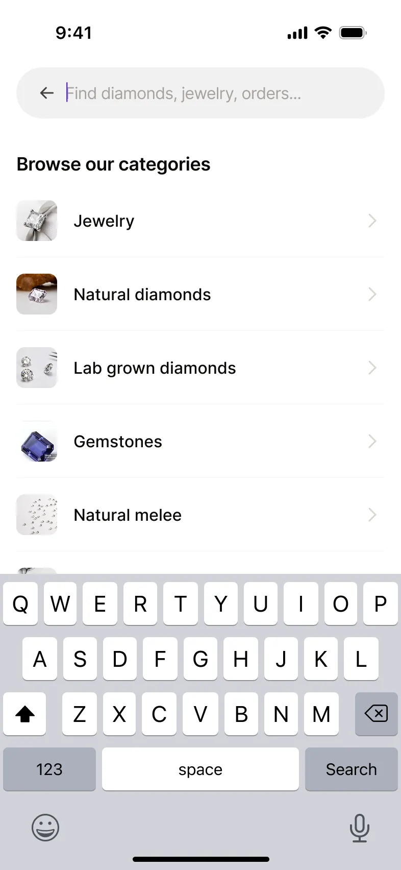
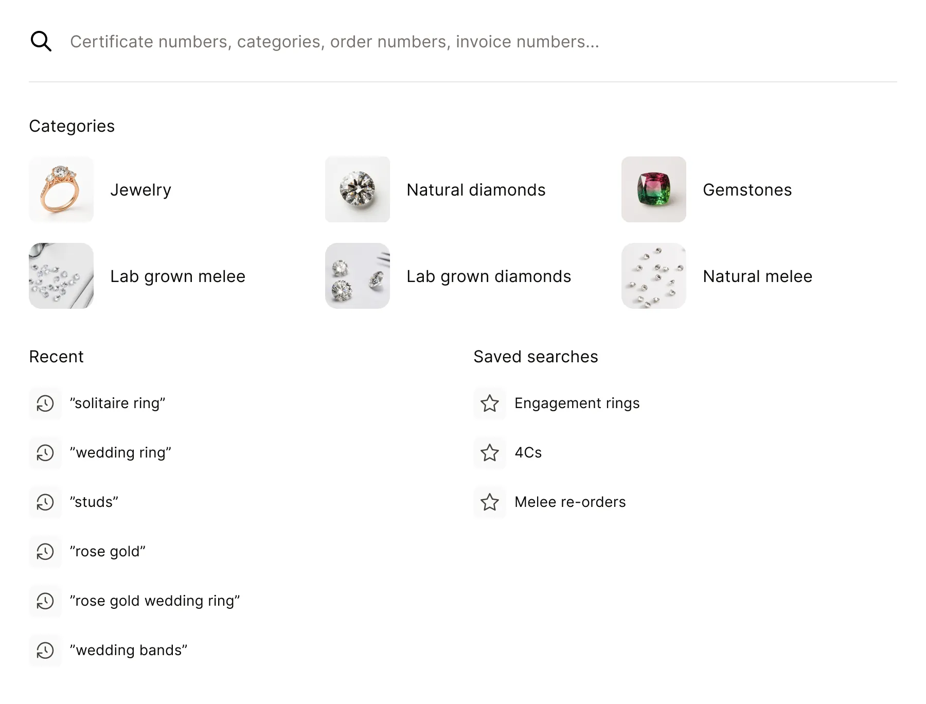
With subtypes now living inside each family's own filter panel, I designed a new mega-menu component that allowed buyers to jump straight into a gemstone type from anywhere on the platform without having to walk the full path every time. The mega-menu mirrors the Gemstones main page structure of 'Popular' and 'A to Z'.
Alongside the category, I designed the new filter panel and took an unfinished product page redesign through to handoff.
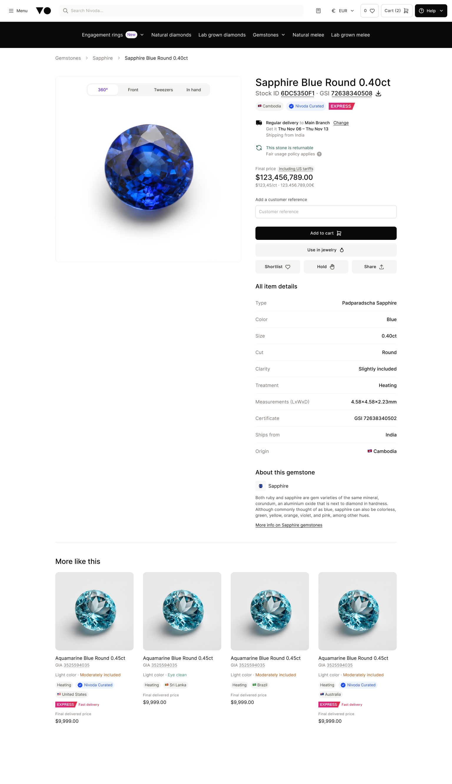

Throughout this phase I worked closely with the engineers, checking each decision against what we could build, what it would cost in resources and how it would shape the roadmap.
Validation.
Before this reached production, I ran two rounds of research.
-
Round 1
Moderated walkthroughs with internal Gemstone stakeholders
5 participants
Web
No objections
People who work closely with gemstone buyers used the prototype and thought out loud. The architecture made sense to everyone. The only issue was the landing page’s top section taking too much space.
Changed: replaced the full grid of category tiles with two rows of popular types and a compact A–Z index. -
Round 2
Unmoderated usability test on a mobile prototype, recruited via Prolific
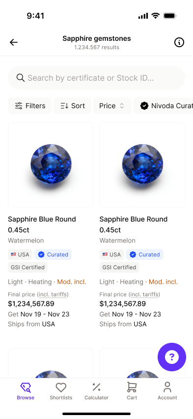
7 participants
Mobile
100% task completion
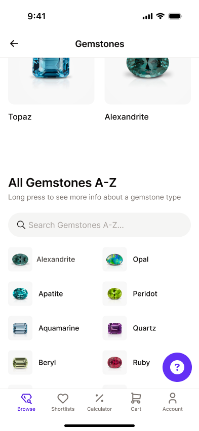
No serious usability issues. Friction came from small subtype labels and a dense A–Z list, and people reached for search out of habit.
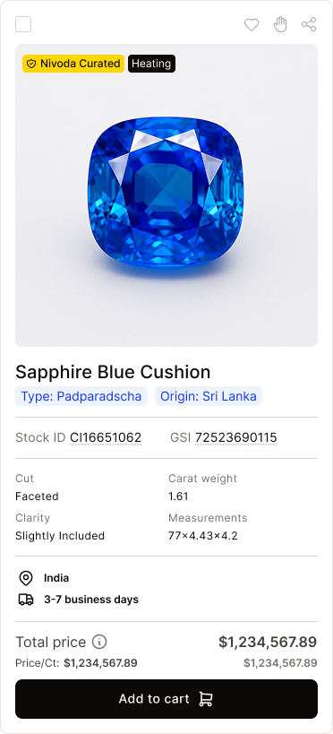
Changed: made subtype labels visible on product cards and added search to the A–Z list.
Neither round questioned the architecture. Only the details needed work.
Outcomes.
Rearchitecting around type-first navigation meant giving something up: top-level, cross-family search like
The PLP became category-specific which meant no more browsing all gemstone families mixed together on one page. I made this call because the evidence supported it, not just because it simplified the release. Buyers start by type. Attributes like colour matter once they’ve narrowed down, and contextual search will cover the cases where they need to come first.
Cross-family search was pushed into a future contextual search and results page initiative already in parallel development, where it could be solved properly rather than bolted onto this release as a compromise.
The redesign shipped to all buyers in December 2025. Gemstones finally had an architecture of its own, instead of sitting on diamond patterns. Post-launch metrics weren’t available to me, but two rounds of testing showed the architecture held up. Its reach also went beyond Gemstones: the mega-menu and the contextual search it helped prioritise became building blocks for other categories, such as Jewellery.